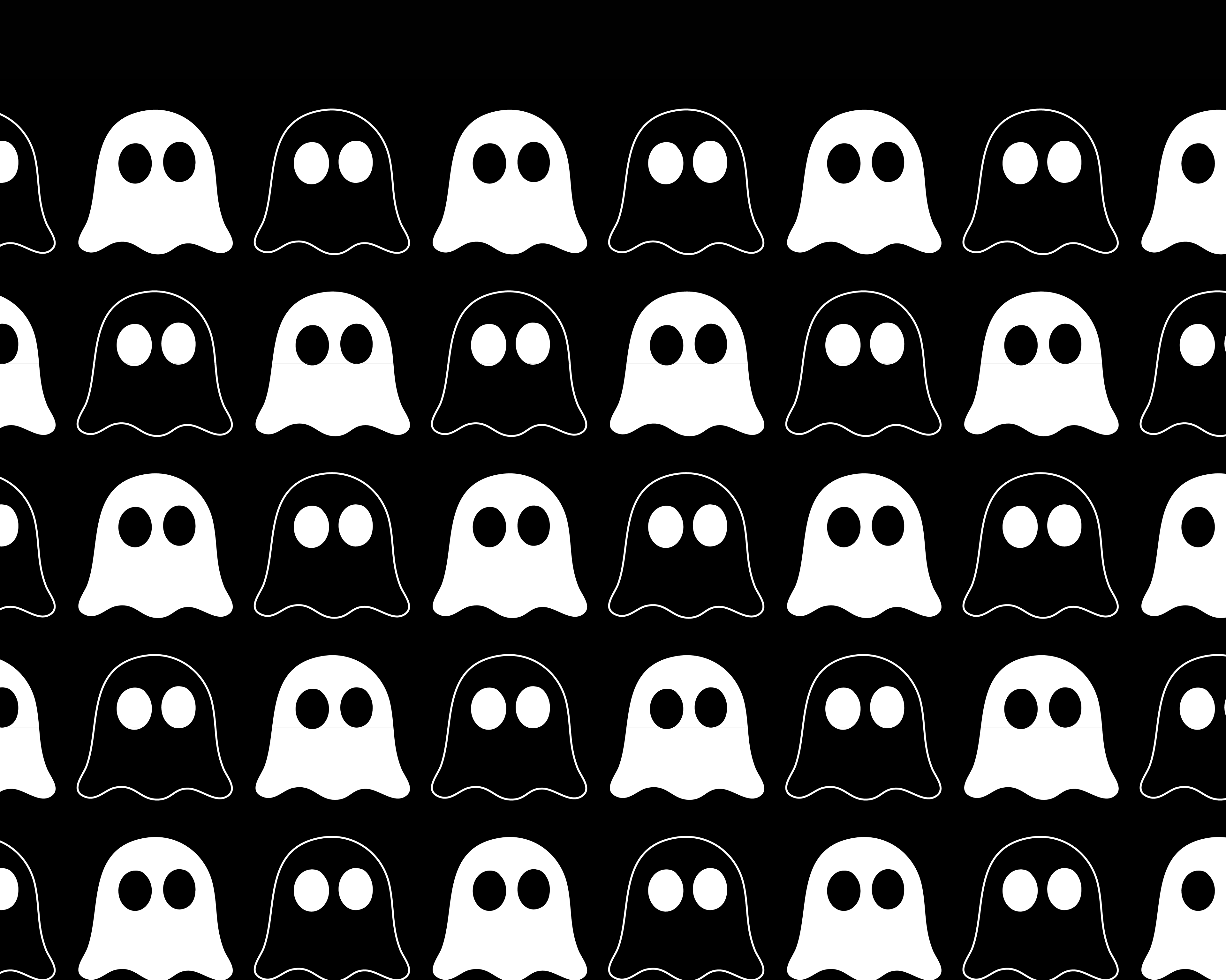
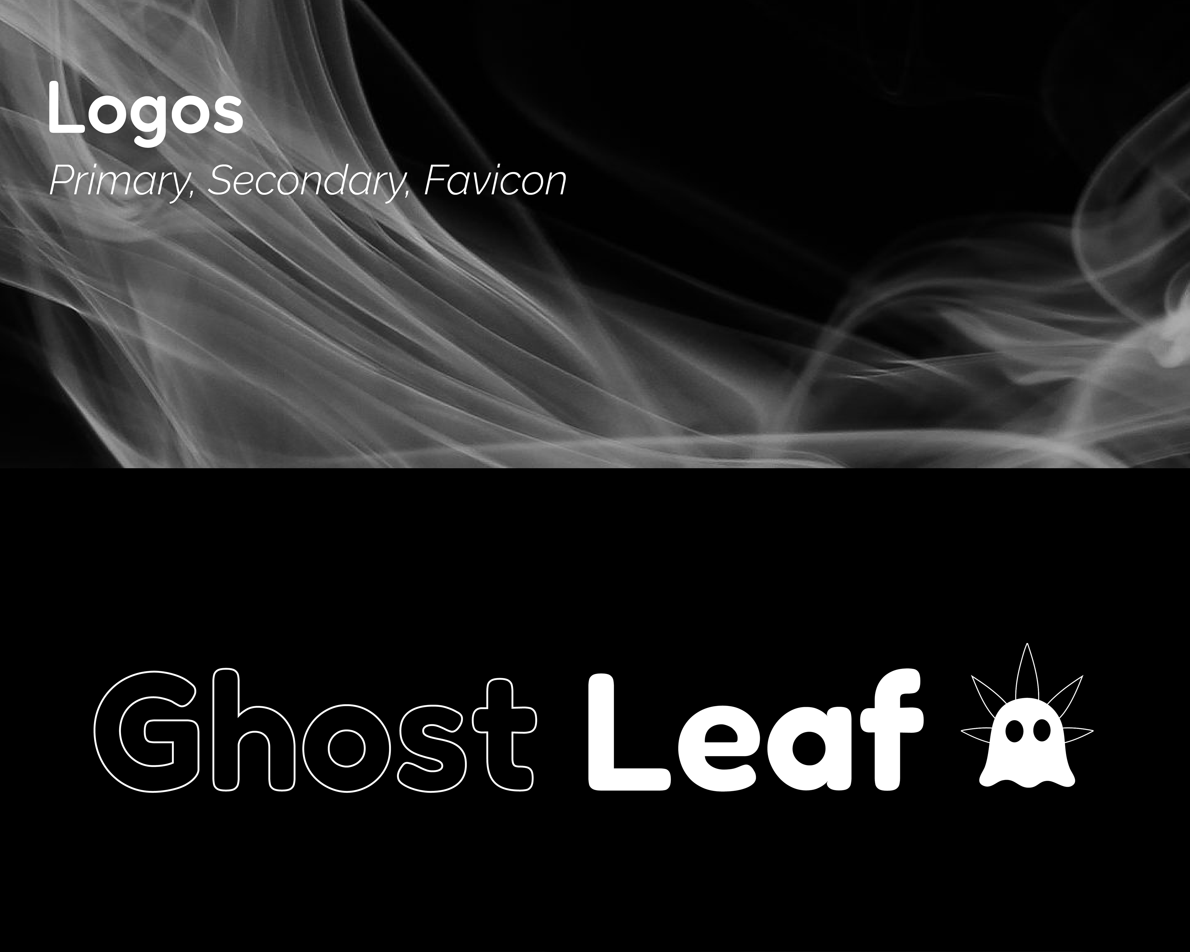
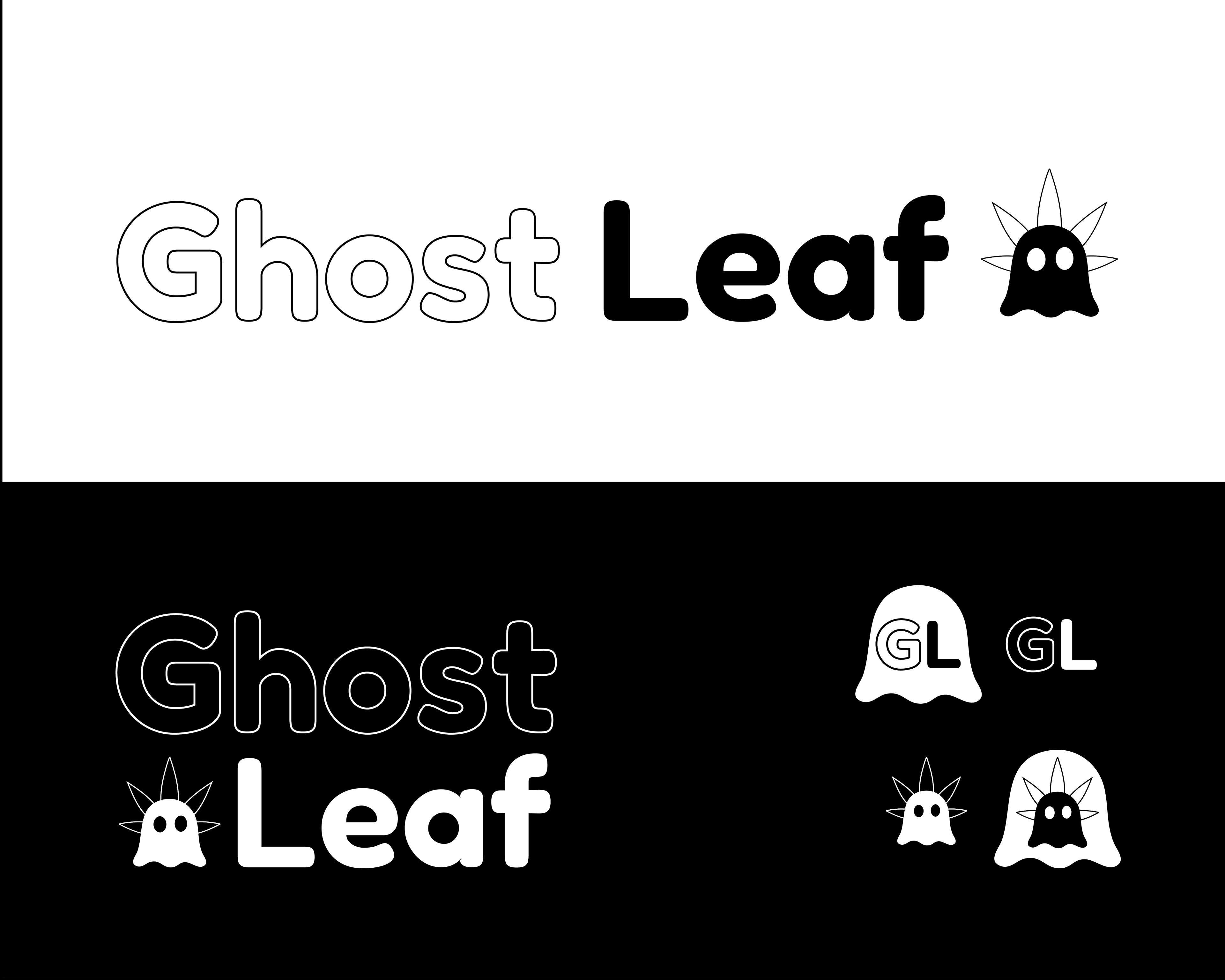
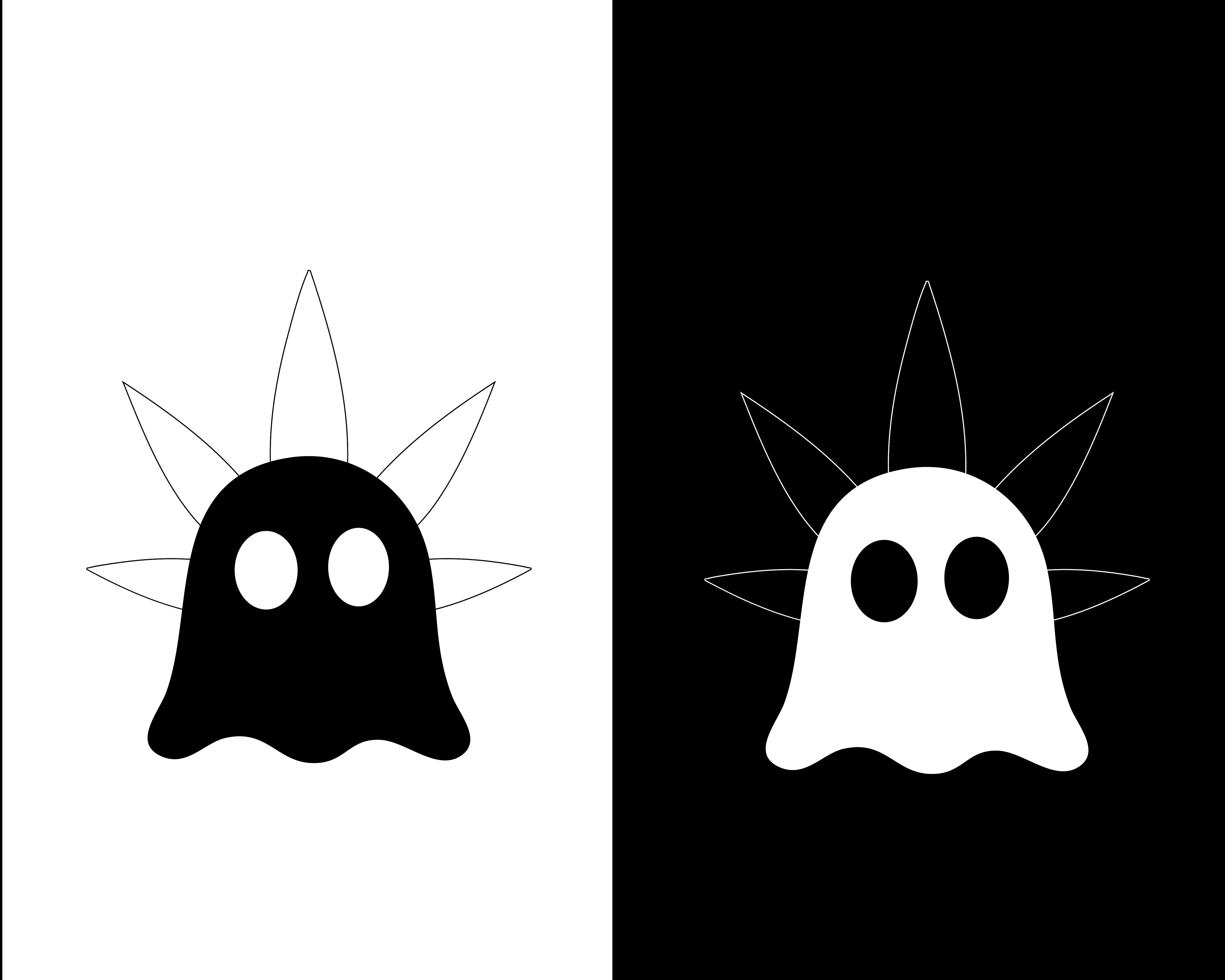
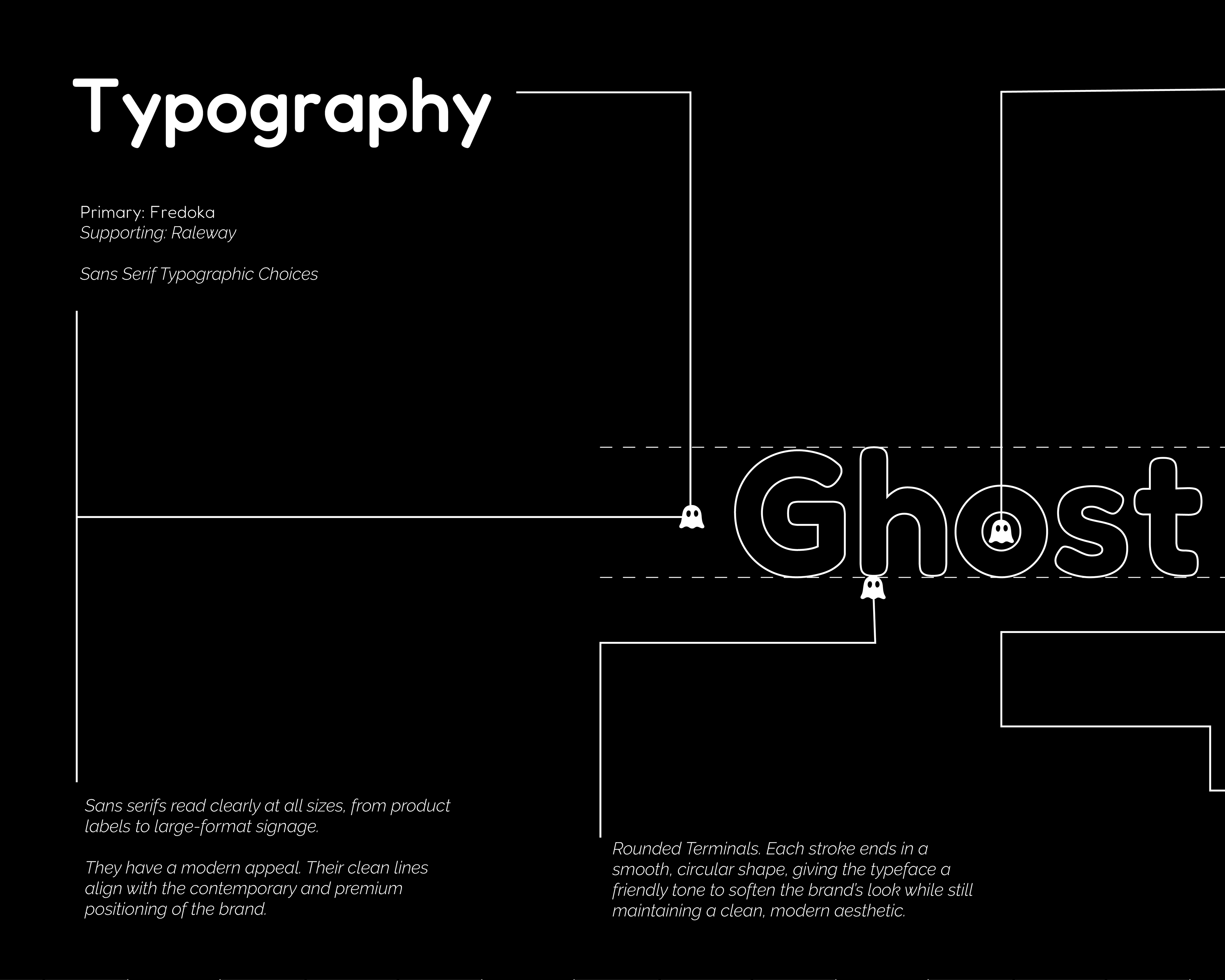
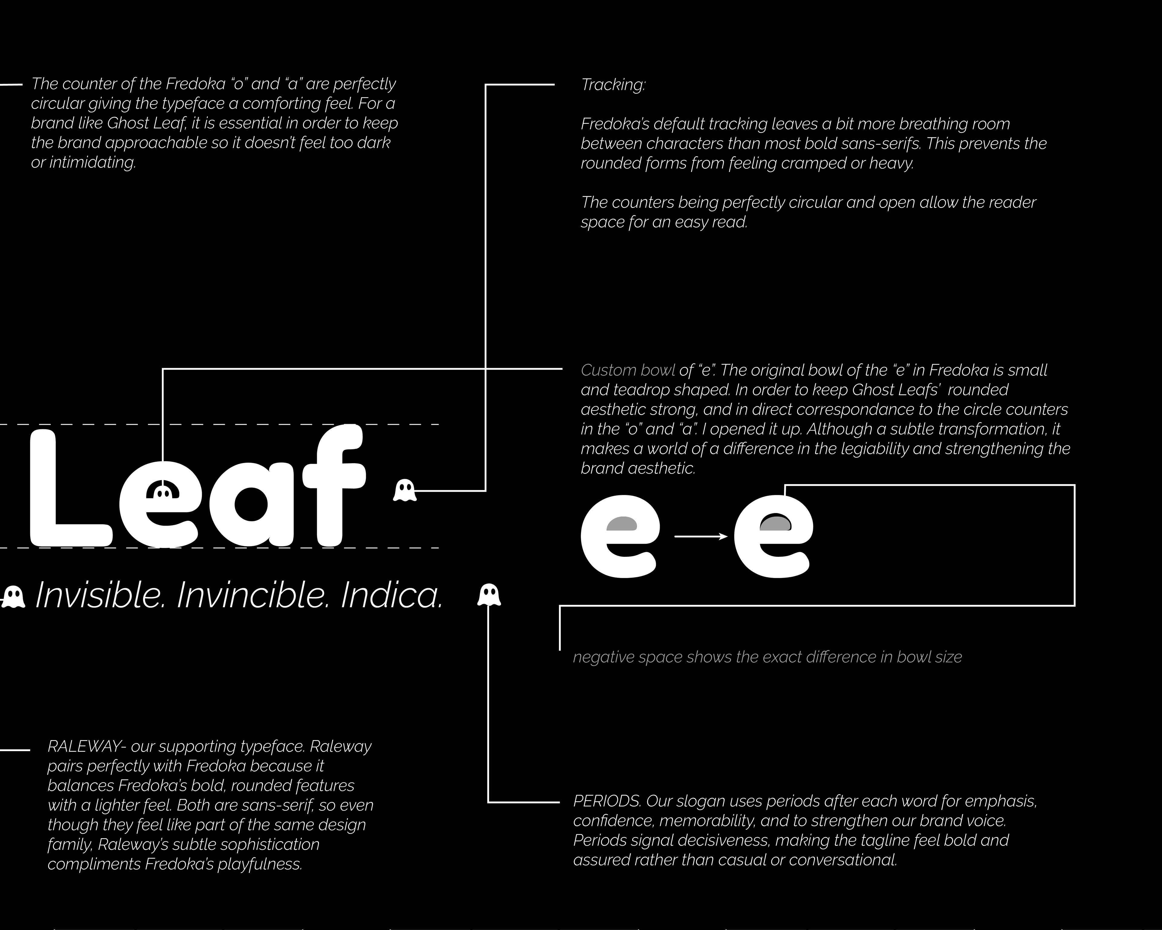
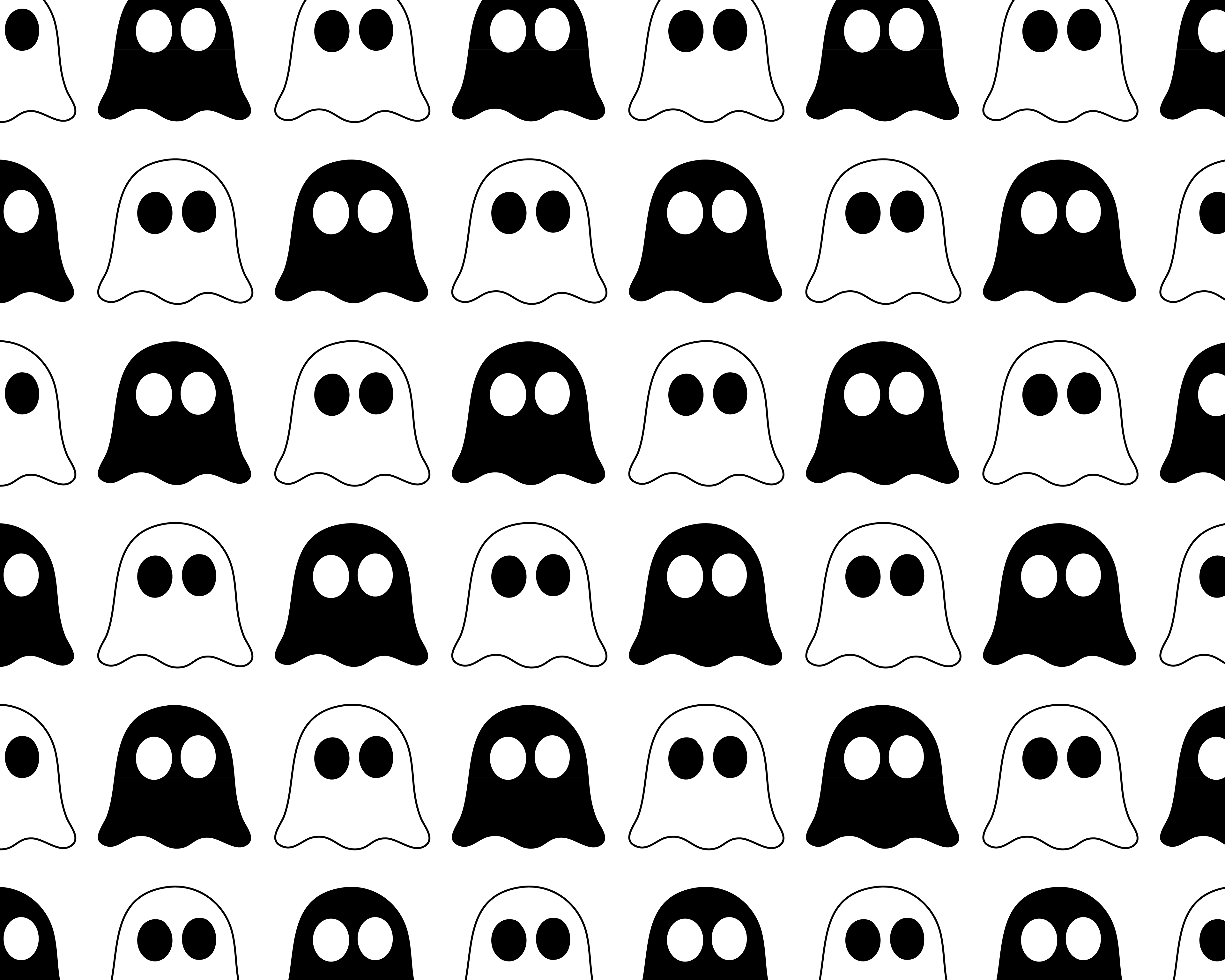
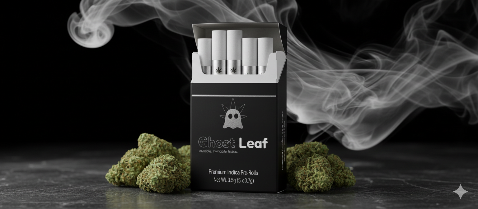
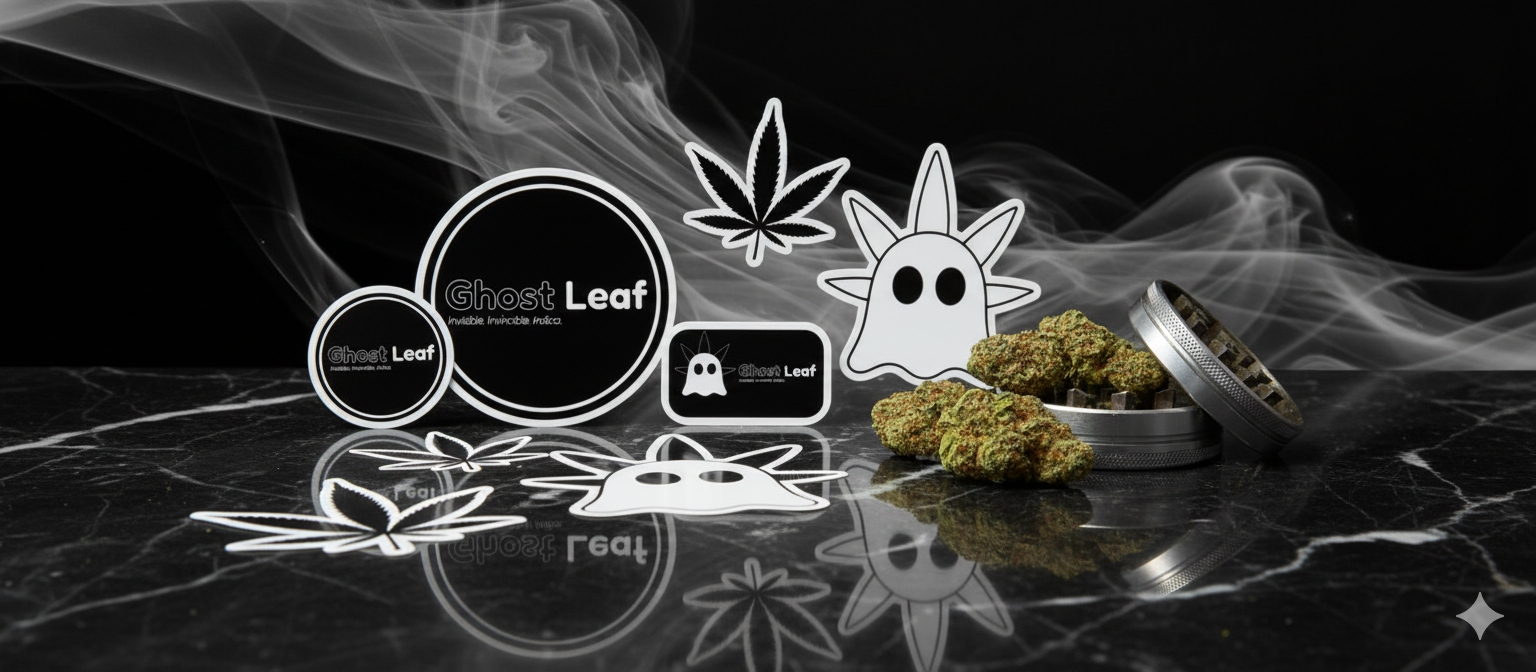
Ghost Leaf’s brand identity centers on simplicity, muted tones, organic forms, and clean typography to establish a modern, grounded foundation. The visual system was designed for flexibility, allowing the brand to scale across multiple touchpoints while maintaining a recognizable presence. The primary logo emphasizes scalability, using negative space and core brand elements to ensure effective use across marketing materials.
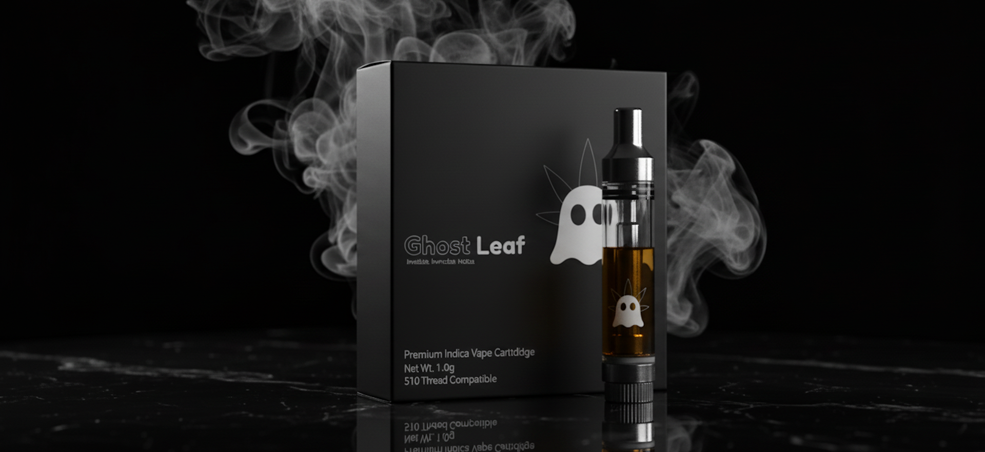
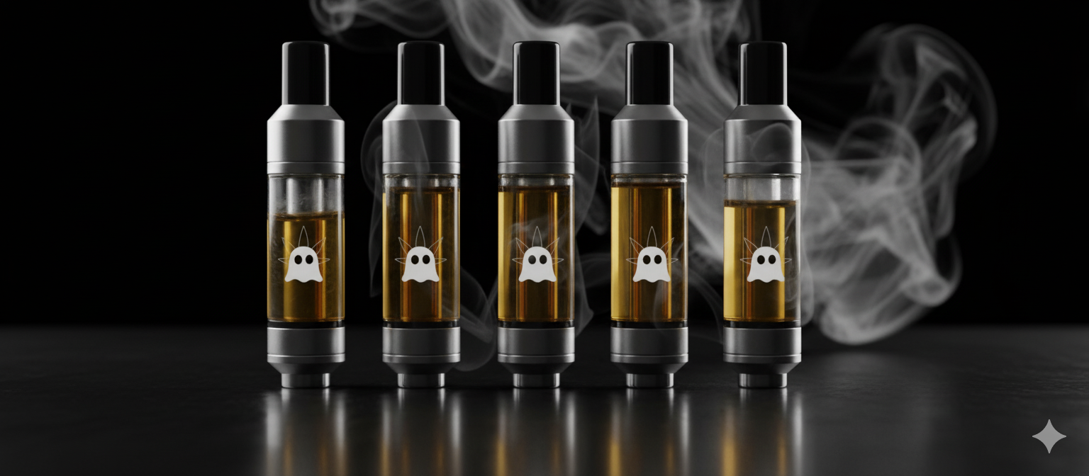
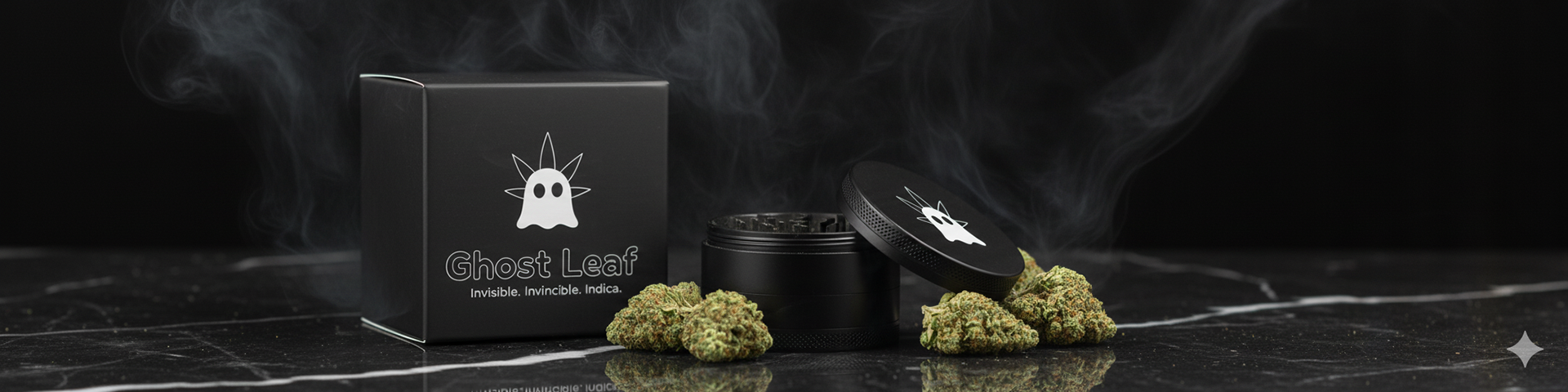
The identity is applied across digital and product-based formats to demonstrate adaptability. Layouts prioritize whitespace, clear hierarchy, and balance, showing how the system translates seamlessly into web and marketing environments while maintaining cohesion across real-world brand applications.