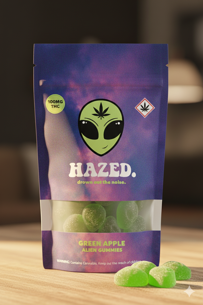
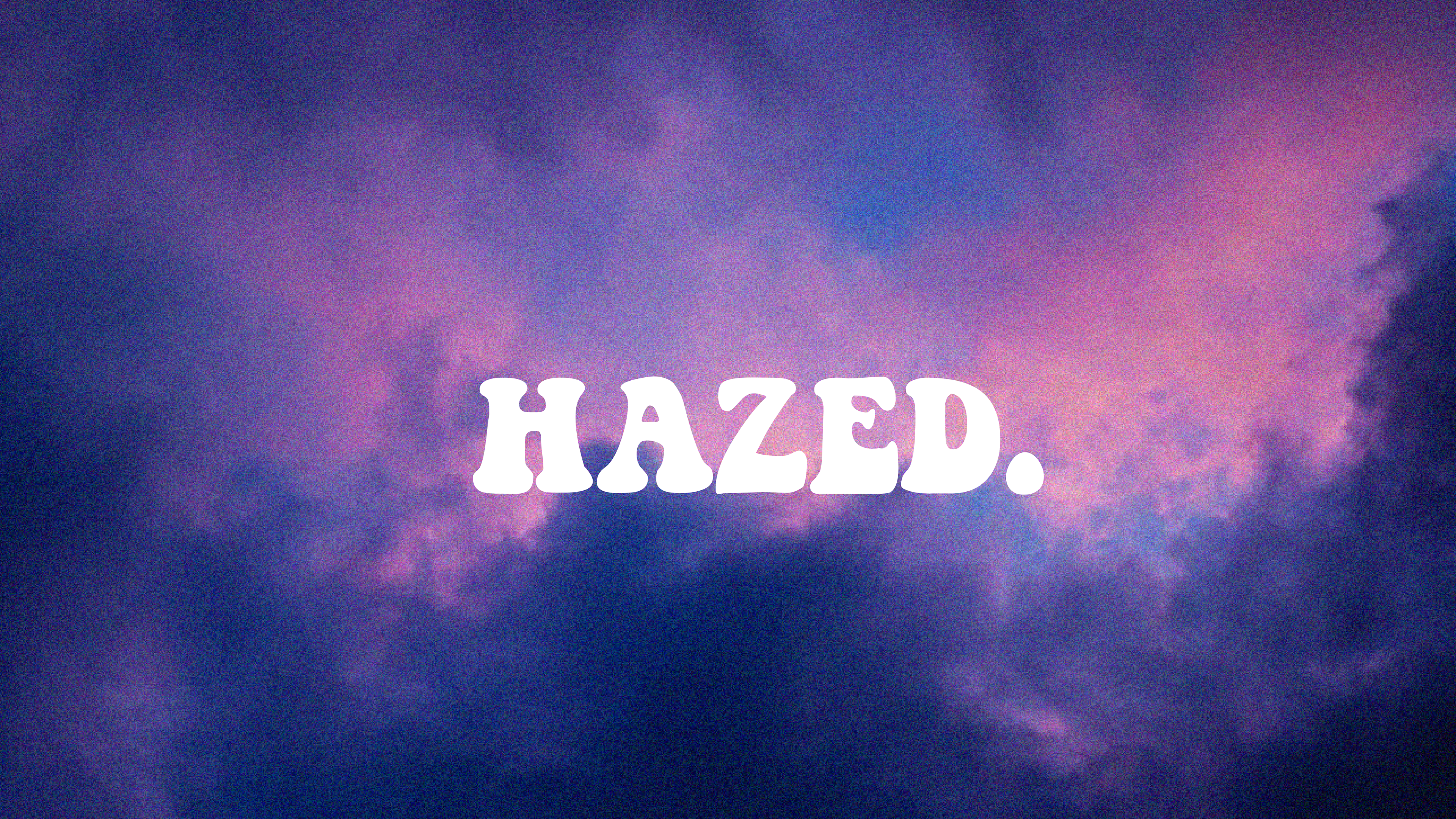
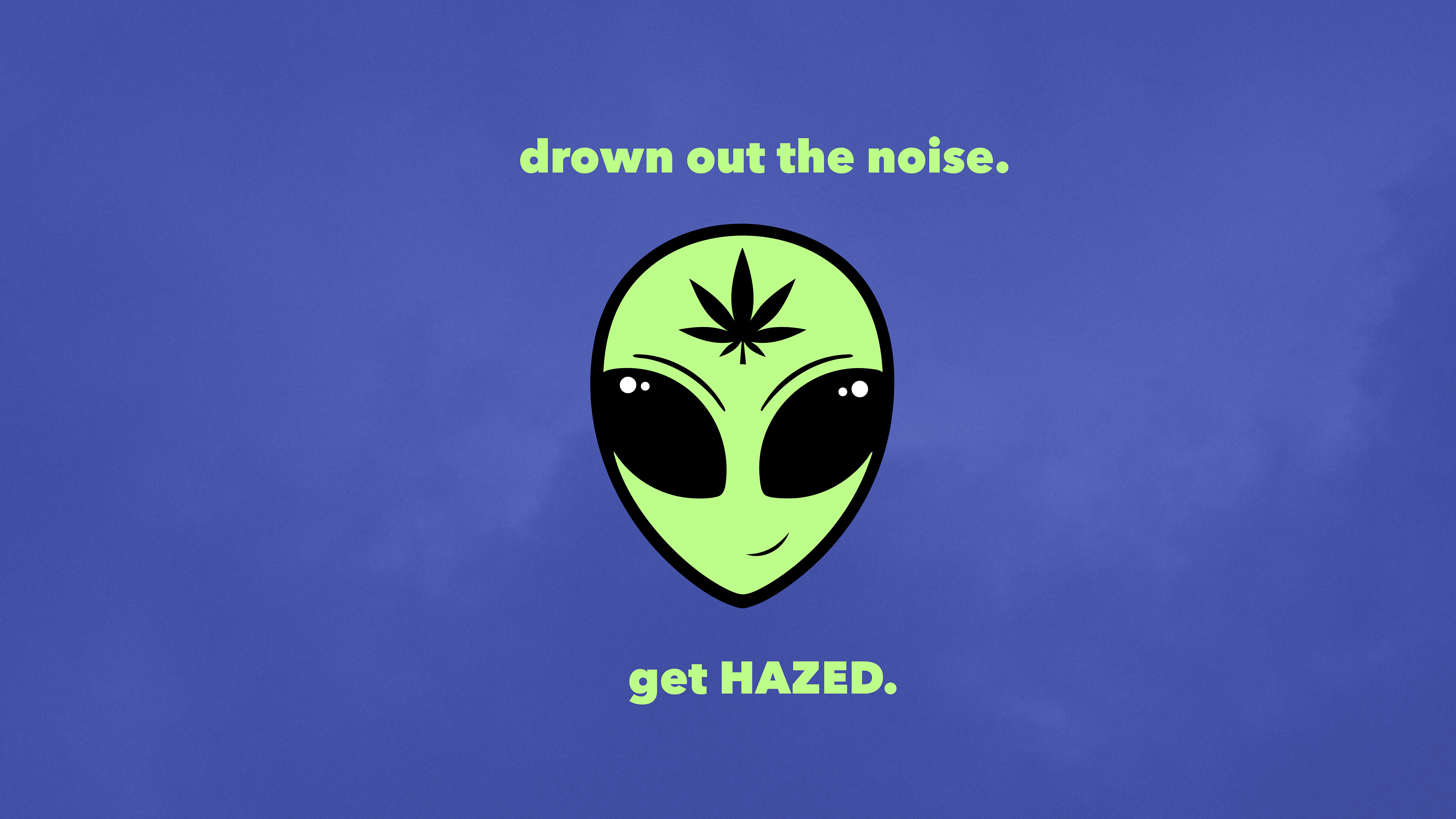
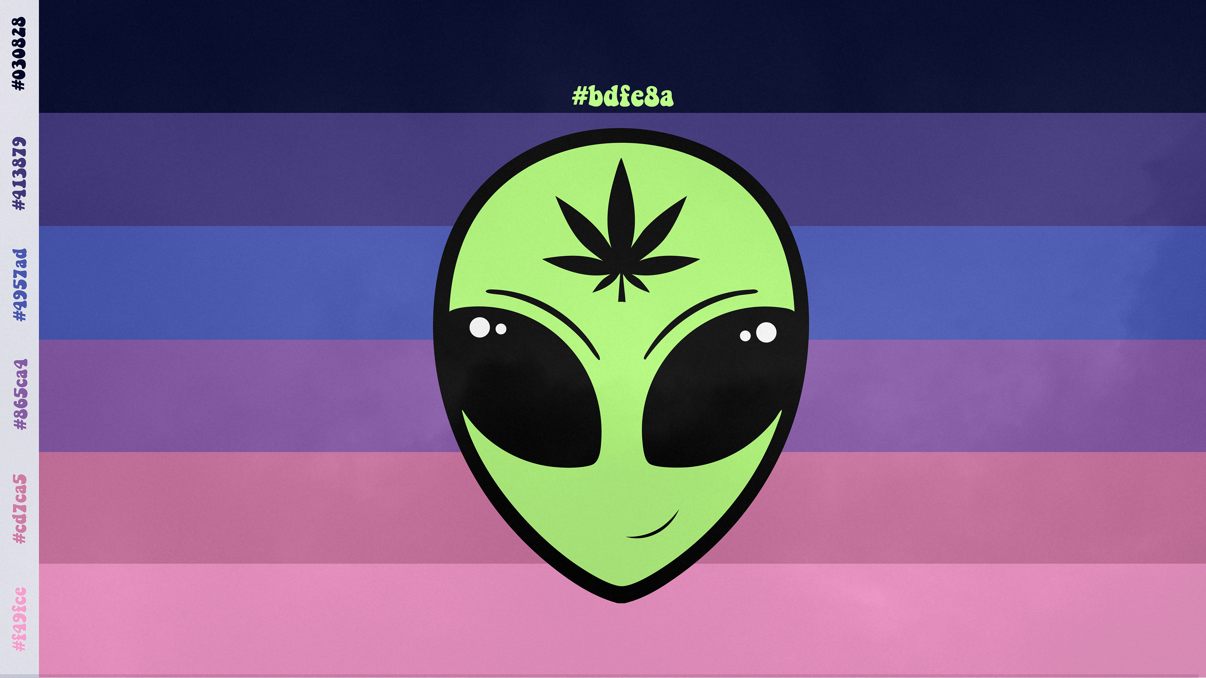
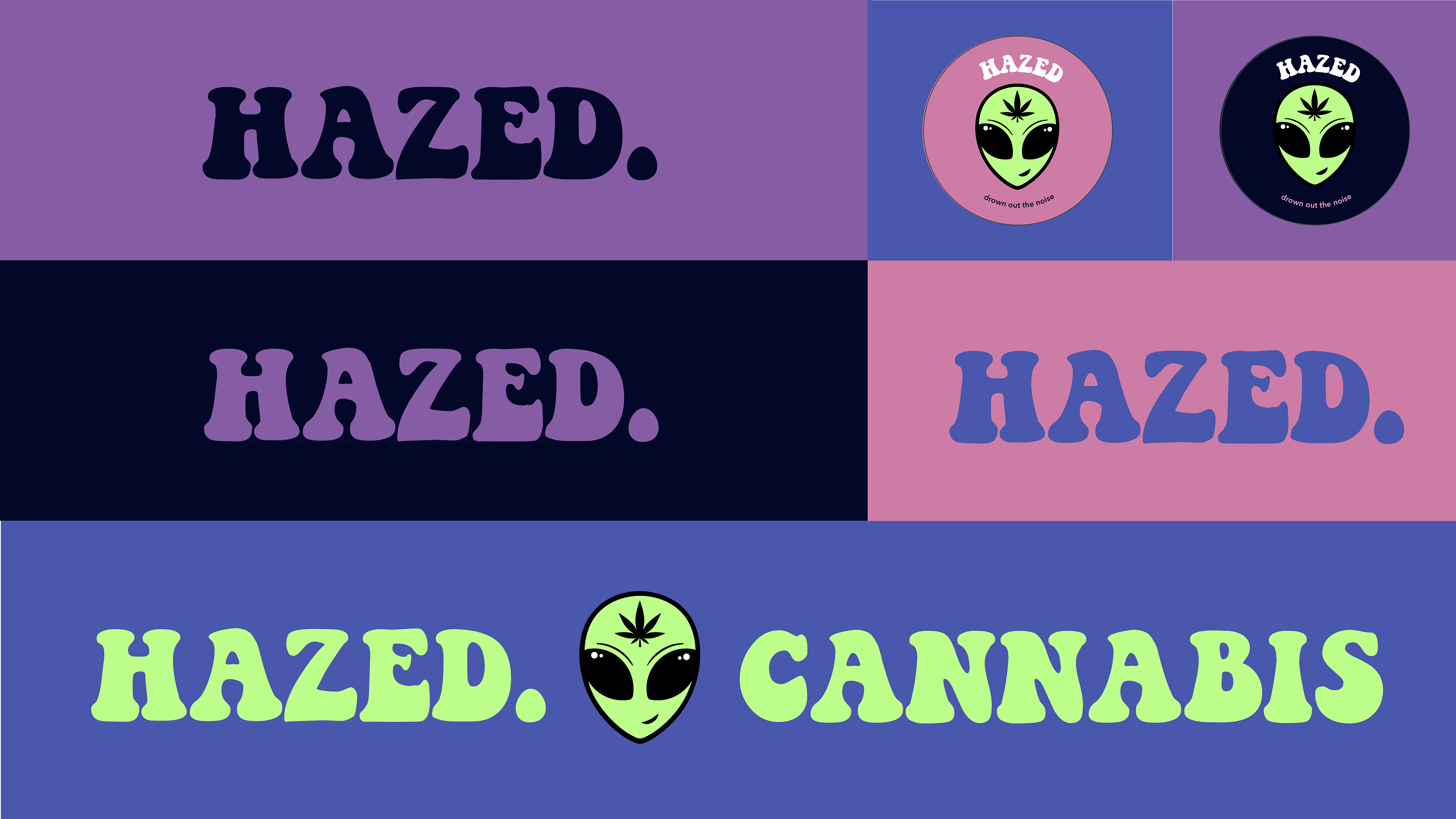
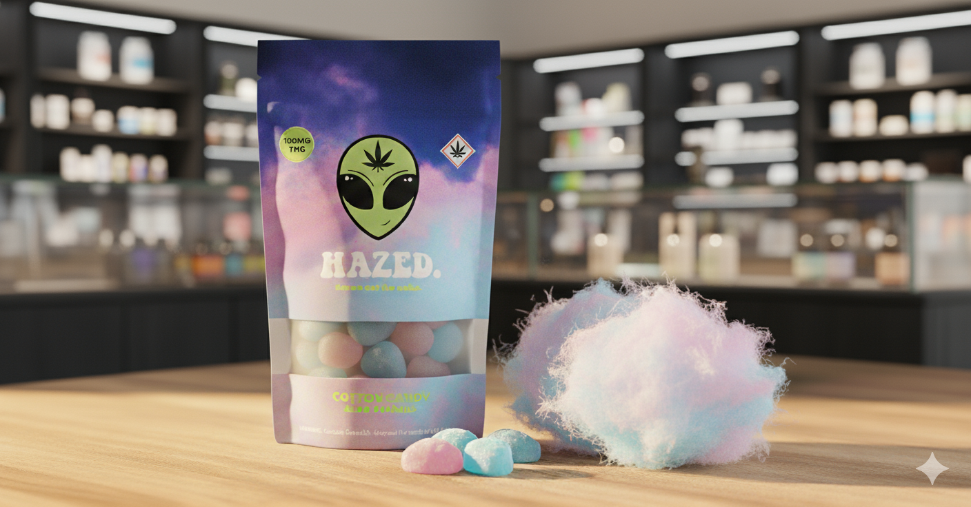
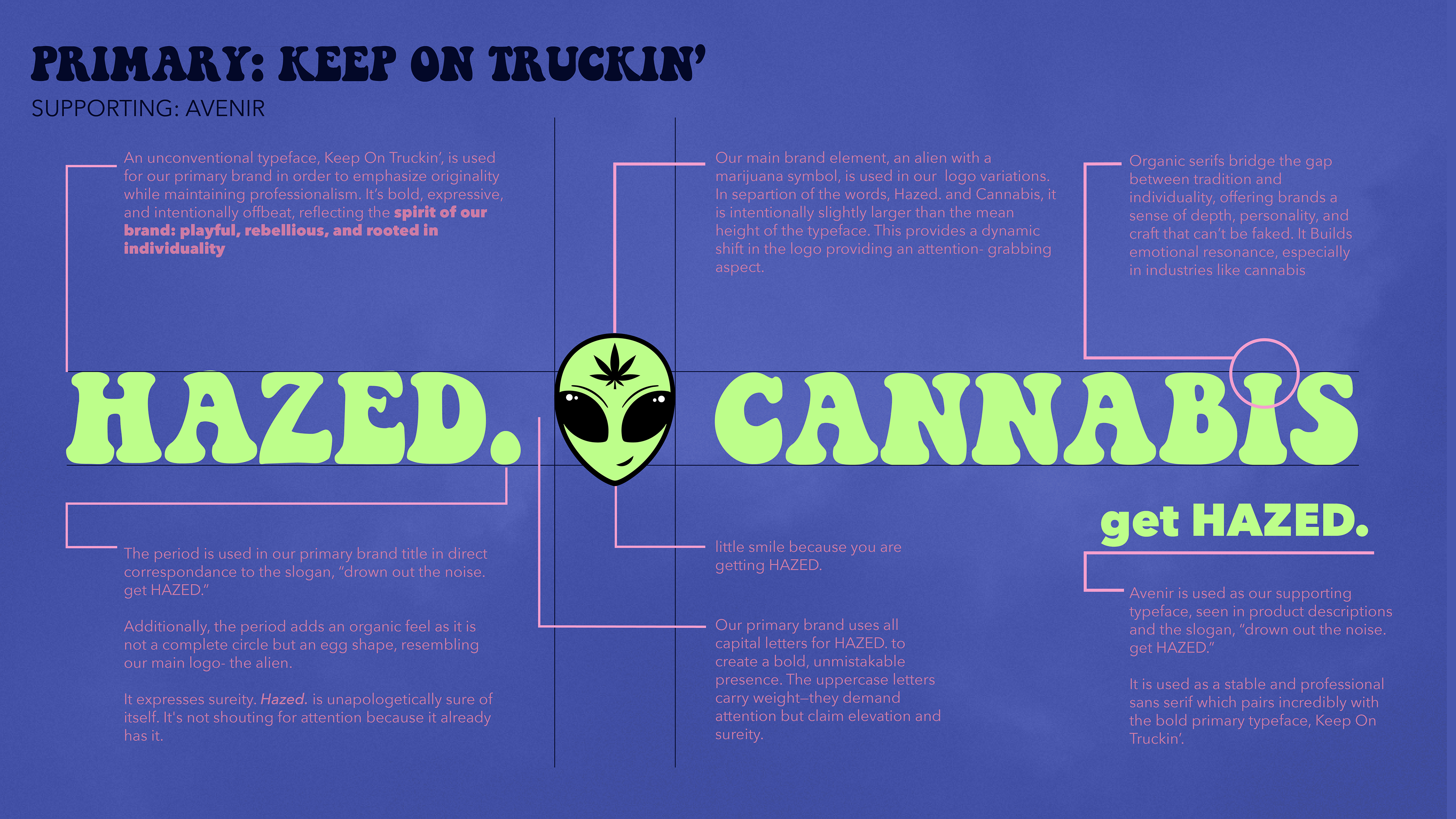
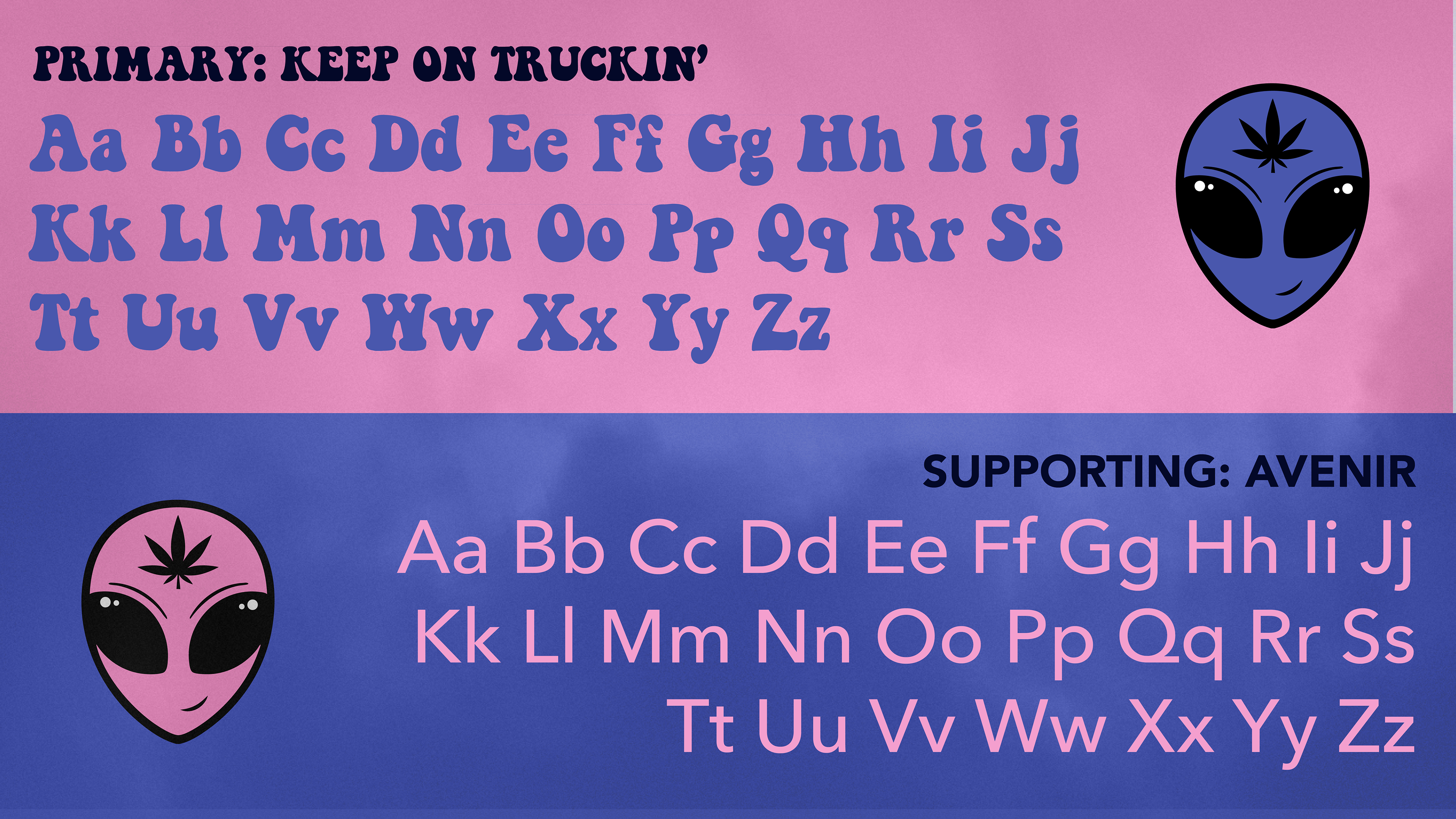
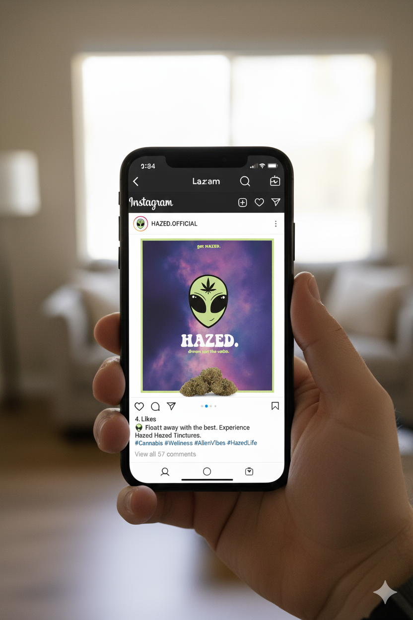
This iteration of the Hazed identity further explores expressive illustration, bold color, and playful typography to refine a brand’s visual language. The system was adjusted to strengthen cohesion while preserving energetic, character-driven personality.
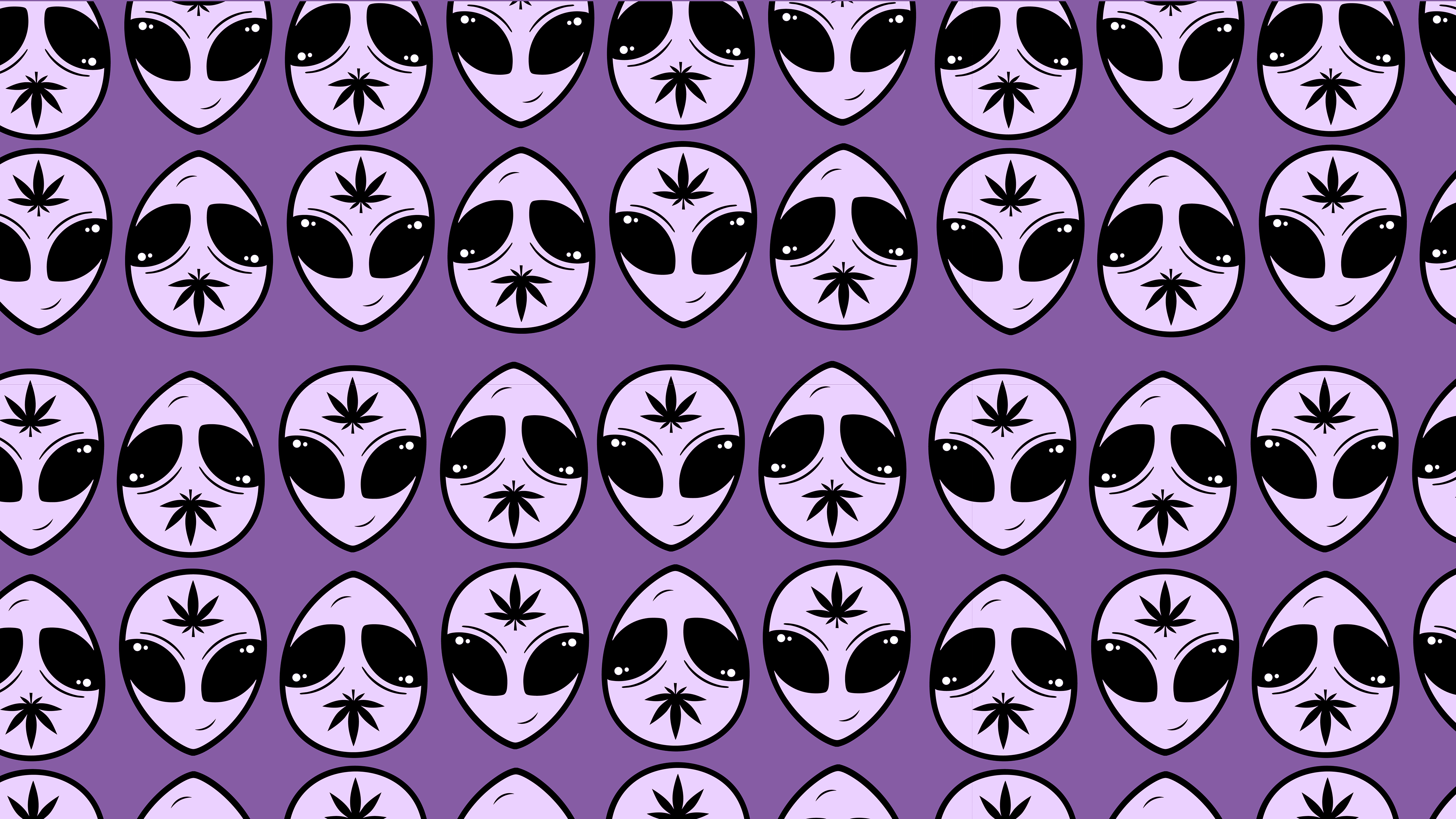
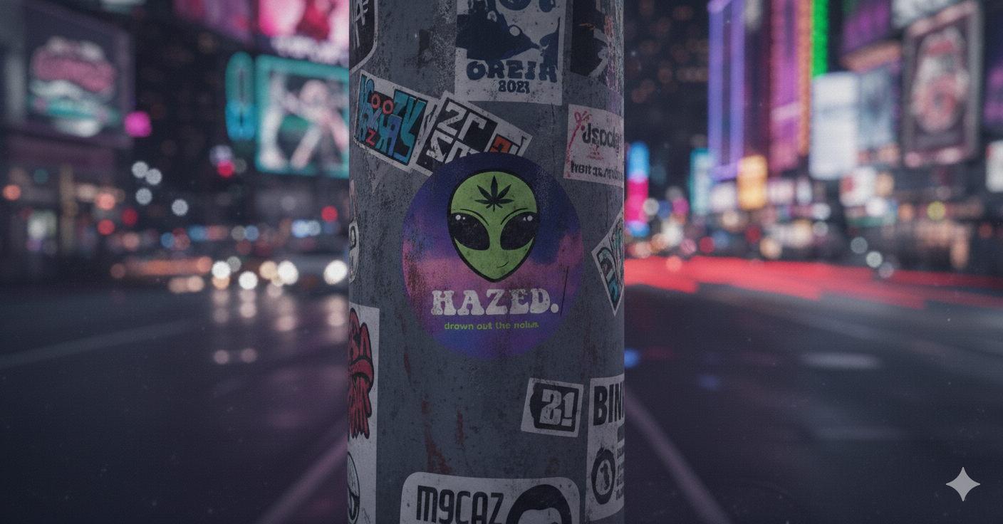
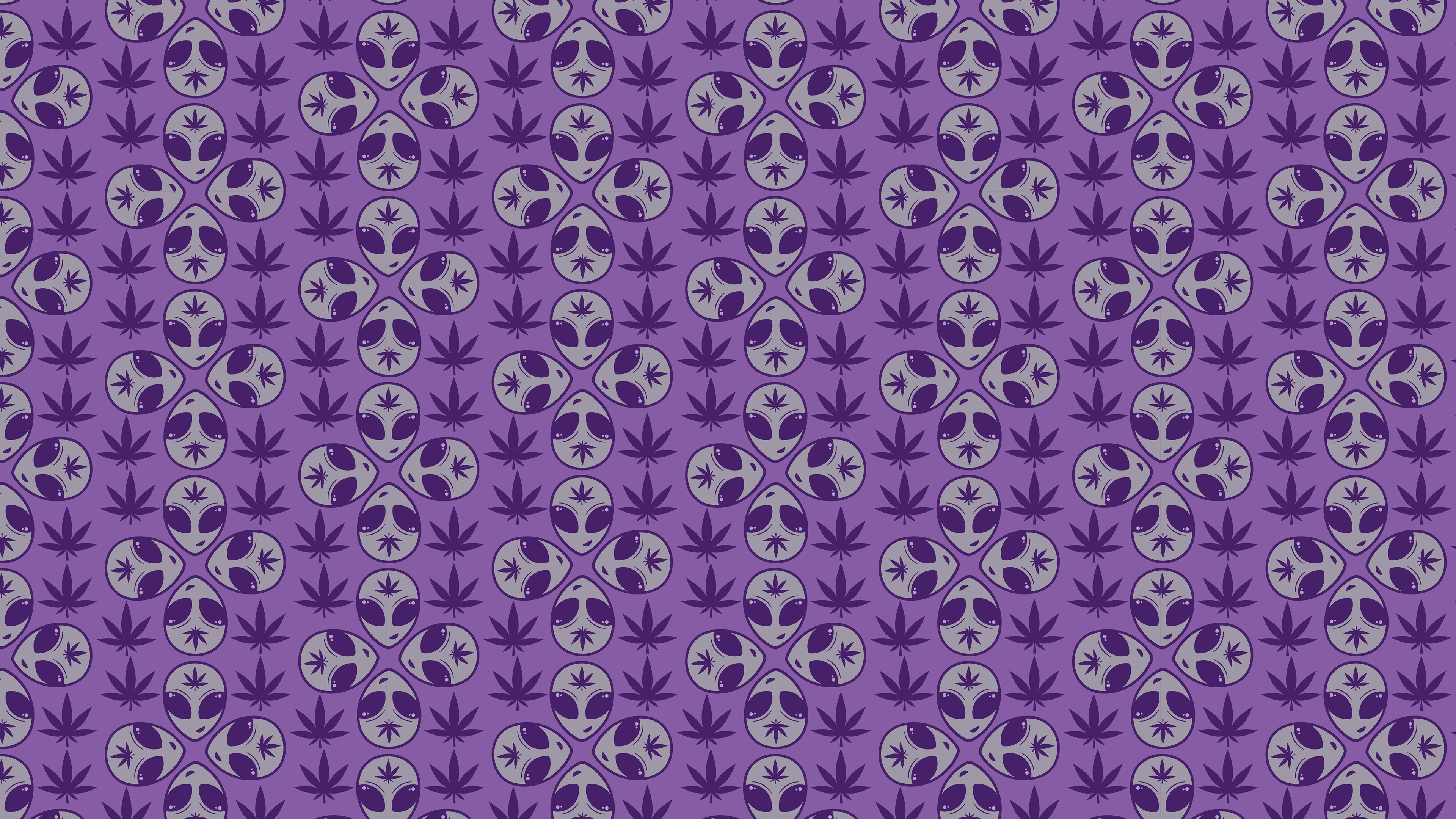
The alien graphic continues to act as a central brand asset, demonstrating how a strong illustrative element can remain flexible and consistent across layouts and applications. The project highlights the importance of iteration in developing a scalable identity that balances creativity with clarity.